Six reasons your team needs data visualisation
Share on socials
Six reasons your team needs data visualisation


Jump to Section
Jump to section
What is data visualisation?
Six reasons to use data visualisation
The bottom line
Ready to make business decisions faster? Let’s explore why data visualisation is a game-changer for your organisation.
Is confusing data holding your teams back?
Every day, knowledge workers are bombarded with information, from social media metrics to sales figures and product insights. No wonder 95% of employees feel overwhelmed by the amount of data at work! With so much raw data competing for our attention, it’s almost impossible to find meaningful insights and make informed decisions.
Enter data visualisation: the secret to instantly understanding your data.
Read on to discover why data visualisation is so crucial - and why it’s at the heart of Forms for Confluence Cloud.
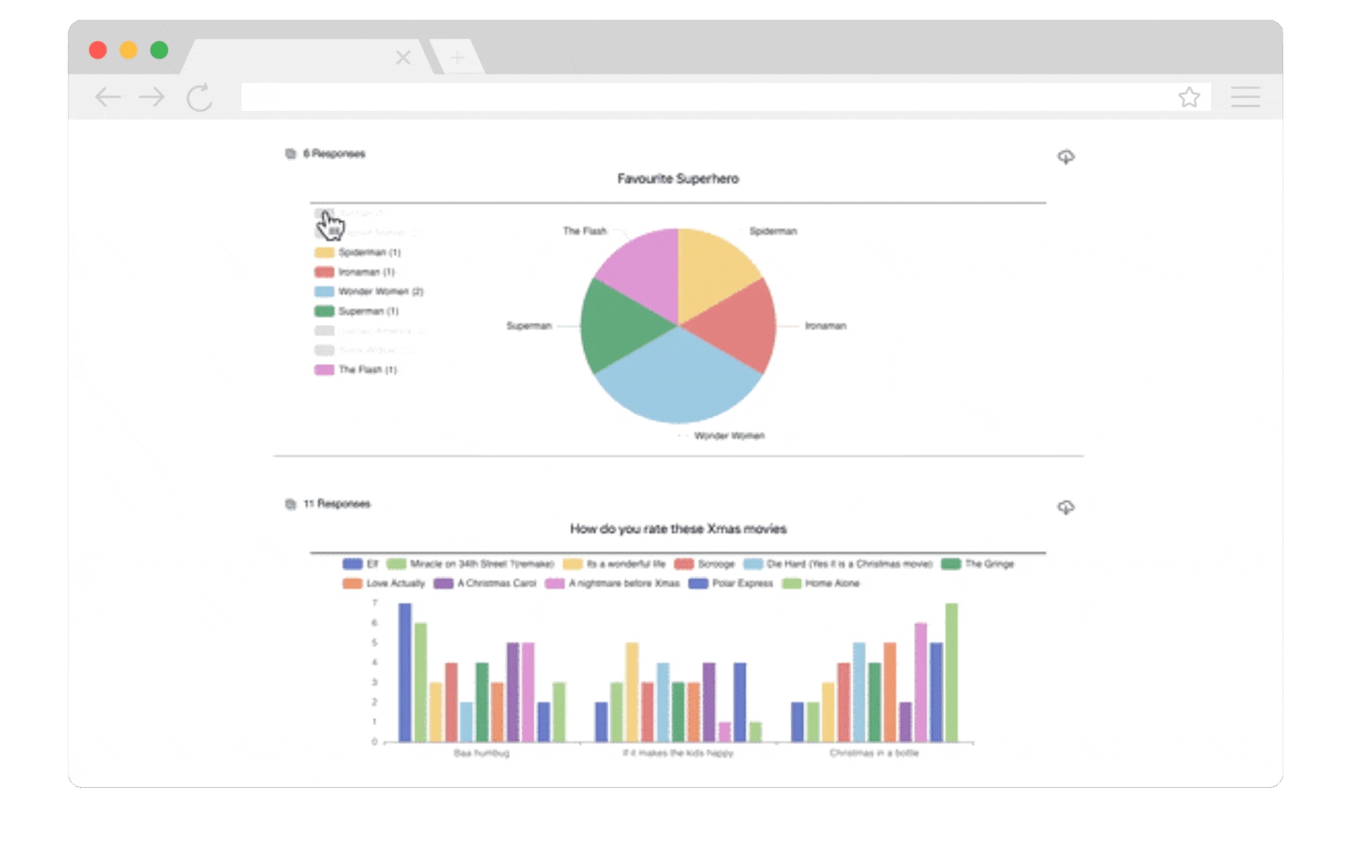
Filtering visualised response data in Forms for Confluence
What is data visualisation?
Data visualisation is the representation of information, data, and statistics through visual elements like graphs and charts. It turns complex information into engaging and visual charts, helping us to easily understand, interpret, and even communicate results to others.
Data visualisation isn't just important - it's essential to creating a successful company.
Data visualisation isn't just important - it's essential to creating a successful company.
Six reasons why data visualisation is vital in the workplace:
1. It removes complexity and confusion
While spotting trends and patterns in raw data is challenging, data visualisation makes it easy. A visual summary helps us understand the bigger picture and speeds up the decision-making process.
2. It improves understanding
We process visual interpretations of data much faster than raw facts and figures. Moreover, images can cross language and communication barriers, helping us to communicate results with diverse audiences and encourage inclusive collaboration.
3. It enables emotive storytelling
Data visualisation breathes life into your data and helps you create compelling stories. Whether you're engaging stakeholders or connecting with customers, it’s easier to create a meaningful connection and make results more memorable.
4. It gives you real-time insights
Data visualisation gives decision-makers instant access to crucial information. Tracking key metrics and performance indicators in real-time encourages faster decision-making when it's needed most.
5. It inspires curiosity
Interactive data visualisation puts the power in your hands. Engaging, responsive charts let you dig into hidden trends and explore data in ways you never thought possible.
6. It helps you anticipate future data trends
Data visualisation helps data analysts in your company to recognise previously hidden patterns in seconds. These insights make forecasting future trends and results possible, letting you predict an activity's outcome before you've even started.
The bottom line
While data visualisation might just look like a few charts and graphs on the surface, it's a powerful tool that helps you take control of your data and prevent it from becoming overwhelming. It gives you the tools to make better-informed decisions, improve communication, and boost problem-solving in one go.
That’s why Forms for Confluence includes data visualisation for your Confluence forms and surveys, so you can focus on translating results into action.
That’s why Forms for Confluence includes data visualisation for your Confluence forms and surveys, so you can focus on translating results into action.
Discover Forms for Confluence and start gathering smarter feedback today:
Related Content
Read more


Written by
Related Content
Read more