
Visualising form data in Confluence: your three-step guide
Share on socials
How to visualise Confluence form data in three simple steps


Jump to Section
Jump to section
How to visualise form data in Confluence
How can visualisation improve understanding?
When would you want to visualise form data?
Is data sending your head spinning? Here’s how to decipher answers faster by visualising form data in Confluence.
So you’ve read our guide to creating forms in Confluence and collected a whole lot of user feedback. Now you’ve got to make sure that data actually means something.
It’s easy to get lost in figures and ideas, but by visualising form data, you can quickly understand and break down responses and results. Research shows that visual data is far easier on our hard-working brains - so let’s get started!
It’s easy to get lost in figures and ideas, but by visualising form data, you can quickly understand and break down responses and results. Research shows that visual data is far easier on our hard-working brains - so let’s get started!
How to visualise form data in Confluence
If you don’t already have Forms for Confluence, you can install it here - it’s free for 30 days. Then follow our guide to create your first Confluence form.
1. Click on the 'Apps' tab in the sidebar, then select Forms for Confluence. This will take you to the Forms for Confluence homepage.

2. From here, click on your chosen form. You should land on the Summary tab - each question will have a relevant chart or visualisation to help you better understand your data.

Note: The chart you see will depend on the type of question it is (e.g. a dropdown question will show a pie chart, whereas a star rating will display a bar graph).
3. You can filter the responses for each chart or graph by clicking on the response names (e.g. ‘Yes’) above it.
3. You can filter the responses for each chart or graph by clicking on the response names (e.g. ‘Yes’) above it.
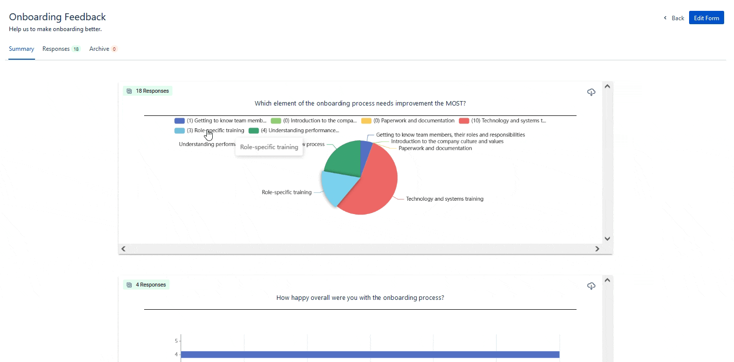
⚡️ Pro Tip: If you want to see how each individual responded to the form questions, just click on the Responses tab. This could help you to compare how employees from different departments or teams feel about a particular issue, for example.
How can visualising form data improve understanding?
Data is crucial in helping us to identify trends, find both problems and solutions, and make informed decisions - no matter the issue. Whether you want to present data to others, or if it’s just for you, there’s one thing that is essential - the data must be easy to understand.
So, how can data visualisation tools help?
So, how can data visualisation tools help?
- They help you instantly see patterns that may not be obvious from viewing raw numerical data alone. This is particularly important for when summary statistics don't tell the full story.
- They can help you predict what trends might appear in the future, meaning you can make smart business decisions and stay ahead of the game. It’s just one reason data visualisation is powerful for teams.
- They make data instantly engaging. Graphs, pie charts, and other chart visualisations can illustrate dramatic differences within datasets, or draw attention to surprising - or even shocking - results.
When would you want to visualise form data?
There are many ways data visualisation helps you to quickly digest information and understand your organisation, employees, and customers at a glance. Here are a few:
- User satisfaction surveys - get an accessible overview of how team members feel about how things are going in the workplace, or discover what works (and what doesn’t) for customers.
- Event planning - instantly see the most popular date to host a company event, which activities are preferred, or how many respondents have special dietary needs.
- Market research - understand consumers’ interest in a product pre-launch, and what the most desired features are.
No matter what feedback you have, visualising form data takes out the guesswork - so you can make decisions quicker.
Get reliable, easy-to-interpret results in a flash with a 30-day free trial of Forms for Confluence.
Related Content
Read more


Written by
Related Content
Read more