
How to use dark mode in Confluence Cloud: the 3-step guide
Share on socials
How to use dark mode in Confluence Cloud: the 3-step guide


Jump to Section
Jump to section
What is dark mode?
How to enable dark mode in Confluence Cloud
The benefits of Confluence dark mode
How to design dark mode-friendly Confluence pages
Create a more eye-friendly reading experience in Confluence! Learn to use Confluence's dark mode and design pages that work for every screen.
Whether you want Confluence to emulate the sleek look of your other apps, or you just want to reduce eye strain, dark mode is here to help. Let's discuss how to use Confluence's Dark Theme, and if you're a content creator, we'll give you some tips to create the best Confluence pages for dark mode users.
What is dark mode?
Dark mode is a setting that displays light text against a dark background. This differs from 'light mode', which displays dark text against a light (often white) background. In Confluence Cloud, dark mode is called 'Dark Theme'.

Switch your interface to dark mode using Confluence's Dark Theme
How to enable dark mode in Confluence Cloud
- Click on your profile icon in the top-right corner to show the Account menu.
- Select "Theme" in the dropdown.
- Choose "Dark".
What are the benefits of Confluence's Dark Theme?
- Research suggests dark mode can actually reduce visual fatigue. That means no more eye strain while staring at long, text-heavy Confluence pages!
- Dark mode is very popular (one large-scale survey found more than 80% of Android users choose dark mode). With many of us using dark mode on other platforms, Confluence’s Dark Theme creates a consistent user experience.
- Many users simply find dark mode more aesthetically pleasing! Confluence's Dark Theme can make your content more visually engaging - if you follow best practices. Scroll down to learn how.
How to design dark mode-friendly Confluence pages
Atlassian reports that a staggering 60% of users choose Dark Theme as their theme of choice. Your Confluence pages need to be capable of displaying just as well on dark pages as on light ones!
As a UX Designer, Anya Poluianova is passionate about designing accessible content for everyone. Here are her top tips for creating pages that work for every screen:
As a UX Designer, Anya Poluianova is passionate about designing accessible content for everyone. Here are her top tips for creating pages that work for every screen:
1. Make text easier to read with workarounds
Confluence’s dark mode creates a subtle contrast between background and text colours, which can make different font styles and weights harder to tell apart. Here are a few solutions:
- Don't just use normal text throughout the page. Confluence Heading Styles (in the editor toolbar) can help you create a structure that guides readers naturally through your content.
- Maintain a consistent structure throughout your page. For example, if you use H2 for section headings, stick to it! Don't switch between H2 and H3 for similar content.
- Add emojis. These will give minor headings more weight and help them stand out from regular text. An emoji is a quick and easy way to draw a user’s eye.
- Use a more neutral colour for less important text. If you have text that needs less emphasis (e.g. it adds extra context), pick a second, neutral colour from Confluence's colour palette.
We’ve combined some of these tips below:

Use different font colours to change the emphasis of your text
⚡️Pro Tip: If you need a more consistent and scalable way to organise content, Numbered Headings can help. This feature automatically numbers your page headings, giving users extra guidance to navigate the page.
2. Highlight important content with Table and Panel macros
The Table and Info Panel already have Atlassian Design tokens applied, which means they’re designed to look great in both Light and Dark Themes. Even better, these Confluence macros are extremely easy to set up!
The Table macro lets you add coloured backgrounds and extra separation between your title and supporting text. The coloured header row is great for emphasising page summaries or highlights.
Experiment with colour combinations to see what stands out best. For Confluence’s Dark Theme, it’s a good idea to use a darker tone background colour and a lighter text colour. These colours will reverse when using light mode.

A coloured background helps titles stand out on light and dark Confluence themes
Another way to highlight Confluence text is with the Panel macro. You can even add an emoji to draw the reader's attention. The Panel macro comes in presets including Info, Success, and Warning, but you can mix and match colours and icons to customise it how you want.

The Panel macro is a great way to highlight content for all screens
3. Check your page before publishing!
Not everyone uses Confluence's Dark Theme. If you want to be inclusive and create accessible pages for everyone in your organisation, you should check how your page looks for Dark Theme and Light Theme users.
Unfortunately, you can't change themes while editing a Confluence page, so you'll need to Publish the page and switch themes from the Account dropdown menu. It might be a little fiddly, but ultimately, the effort is worth it to create pages accessible for everyone.
Unfortunately, you can't change themes while editing a Confluence page, so you'll need to Publish the page and switch themes from the Account dropdown menu. It might be a little fiddly, but ultimately, the effort is worth it to create pages accessible for everyone.
⚡️Pro Tip: If you're still working on a page, you can click 'Publish' and change the user permissions to hide it from users, or you can add an Alert macro to let people know it's a work in progress.
Dark or light, your Confluence page design matters
Dark mode isn't just a passing trend - it's a useful feature that helps you view content how you want. But even if users decide to keep their Confluence theme light, you still need to design Confluence pages that are easy to read, understand, and navigate.
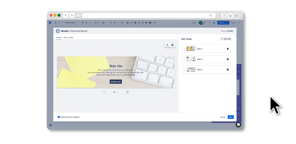
Quickly preview macros against dark and light backgrounds with Content Formatting Macros
If you need a little help, meet Mosaic: Content Formatting Macros & Templates, your ultimate Confluence sidekick. It includes plenty of macros to make your pages more structured and engaging. It’s even easy to make sure macros look great on every screen - just switch between the moon and sun icons to get an easy preview, with no need to publish the page first.
Start creating better content for every screen.
Try Mosaic for free today👇
Try Mosaic for free today👇


Written by

UX Designer
Anya is a Product-led UX Designer who specialises in user-centric design, service design, and user research with years of hands-on experience. She strives to create products that positively impact the customer and the business.