
How to structure Confluence pages: 5 secrets to success
Share on socials
How to structure Confluence pages: 5 secrets to success


Jump to Section
Jump to section
Why page structure matters
How to improve Confluence page structure
- 1. Use a clear hierarchy
- 2. Clear clutter with expands and tabs
- 3. Break up text with visual elements
- 4. Use bullet points and lists
- 5. Incorporate dividers and layouts
Learning these secrets for creating the best Confluence page structure will change everything. Here’s what you need to know.
It doesn’t matter how valuable, well-thought-out, or interesting your content is - it’s the layout that will really make or break your page. For your Confluence page to be a success, you should be putting as much thought into structure as the written content itself.
Fortunately, you don't have to start from scratch. In this guide, we’ll be sharing five secrets to boosting your page structure and creating the best Confluence pages.
Fortunately, you don't have to start from scratch. In this guide, we’ll be sharing five secrets to boosting your page structure and creating the best Confluence pages.
Why is Confluence page structure important?
Think about how you read a webpage. If you’re looking for a specific piece of information, you scan the page to find it quickly. If you’re reading a longer article, the layout needs to hold your attention and make the information easy to digest.
Did you know that on average, users spend a surprisingly low 5.59 seconds reading the content on a web page? With user attention being hard to keep, your information must be engaging and easy to find.
Users interact with Confluence pages in the same way, so getting the user experience (UX) right is crucial.
Similarly, it was found that 79% of users scan new web pages, meaning that making your content scannable is a must for usability.
A well-structured Confluence page signposts information clearly, helping users find what they need in those crucial first few seconds.
Similarly, it was found that 79% of users scan new web pages, meaning that making your content scannable is a must for usability.
A well-structured Confluence page signposts information clearly, helping users find what they need in those crucial first few seconds.
How to improve your Confluence page structure
1. Use a clear hierarchy
Use headings and subheadings to clearly signpost the different sections of your page. This breaks up the text, making it easier to read and helping users retain information.
For long, text-heavy Confluence pages with many sections, numbered headings can help users find what they need in seconds. They’re especially useful for lists, steps, or instructions.
When to use headings and subheadings:
- Making academic content or reports easier to navigate.
- Breaking technical documentation into smaller, bite-sized chunks.
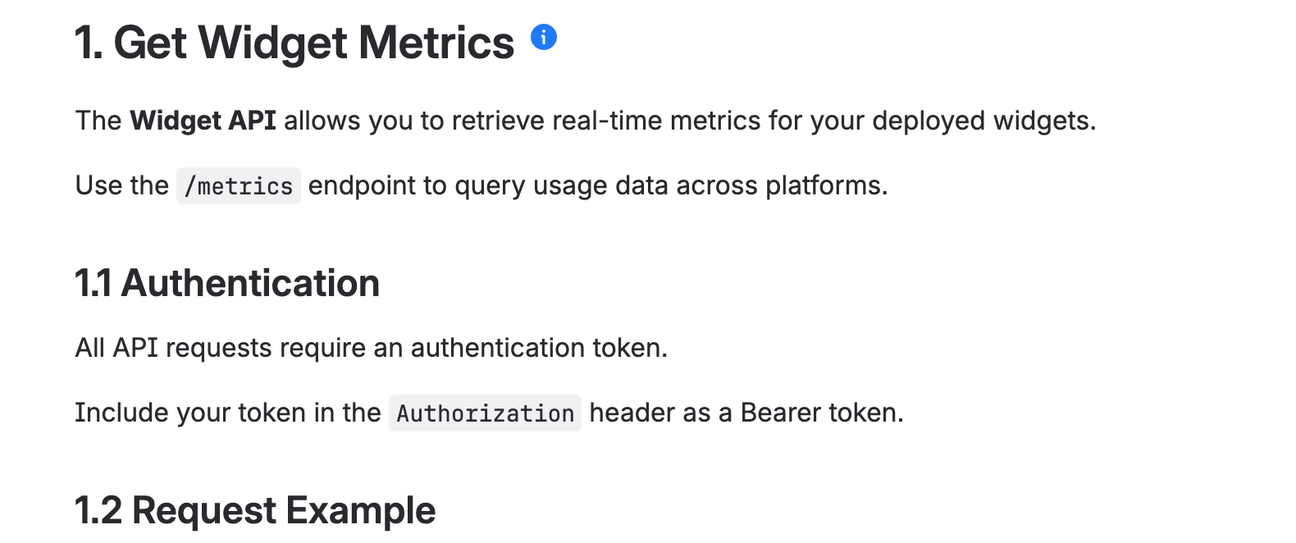
Numbered Headings, included in Mosaic for Confluence, are a great way to make your page more navigable
2. Clear clutter with collapsible sections and tabs
A long, too busy, or text-heavy page can quickly turn users away. A great way to avoid this is by using collapsible sections (also known as accordions or expand macros). These allow users to hide and reveal content, reducing the amount of text on the page at any one time.
Similarly, Confluence tabs give users the power to click through different sections of information, adding a clean, organised feel to your pages.
When to use collapsible sections:
- Organising FAQs into related topics
- Showing different code examples in documentation
- Illustrating different steps in a how-to guide
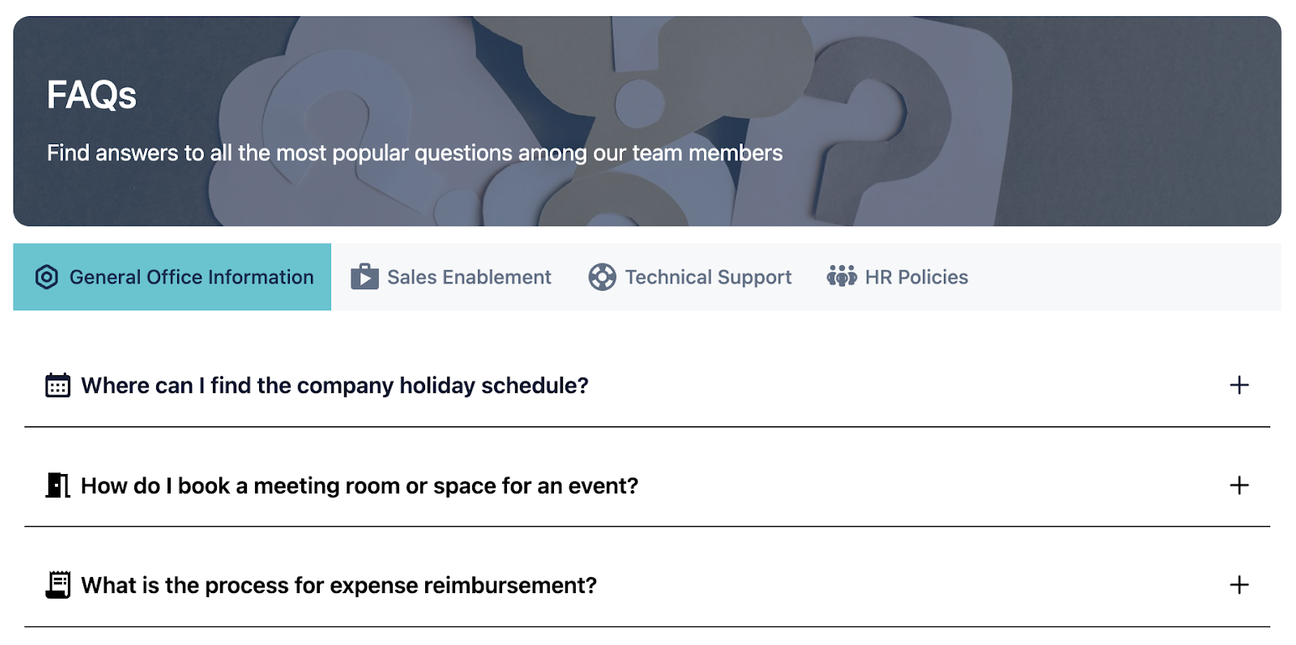
Structure your FAQs with Tabs and Advanced Expand macros, included with Mosaic for Confluence
3. Break up text with visual elements
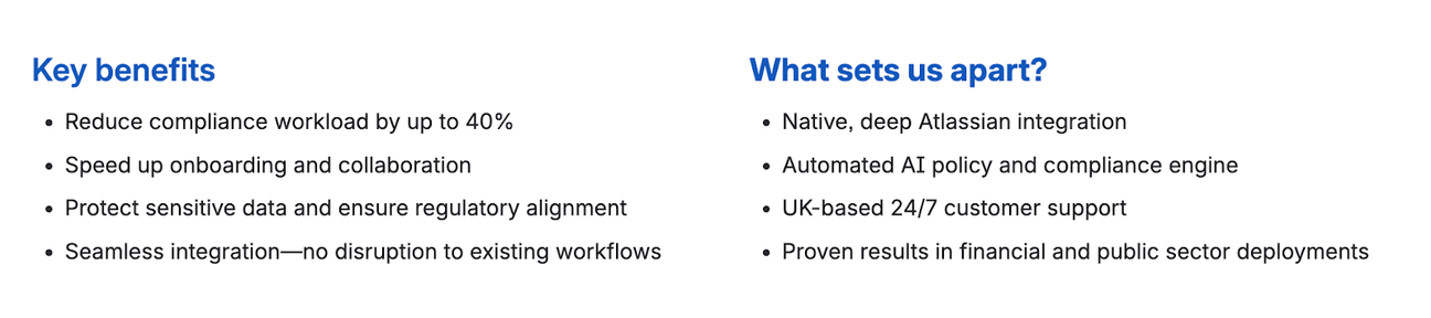
In a study by Adobe, almost two-thirds of people said that if they were to consume content for 15 minutes, they'd rather read something well-designed than something plain. Visual elements like cards are a great way to display links in a more engaging and organised way, breaking up long blocks of text with colour and visual interest.

Visual Advanced Cards come included with Mosaic for Confluence
Interactive banners are another excellent option. They can display headlines and highlight important announcements in a rotating carousel, saving space and keeping the page dynamic.
When to use visual elements:
- Sharing a company announcement with a link to a survey.
- Linking to featured product news in your customer-facing knowledge base.
- Creating a rotating gallery of photos from a company event.

Interactive Banners (included with Mosaic for Confluence) present announcements in a space-saving carousel
4. Use bullet points and lists
Adding white space to your page gives your users’ eyes a rest, helping them to read better and stay on the page longer. Bullet points and lists are perfect for this. They not only add white space but also break down complex information, making it easier to understand at a glance.
When to use bullet points and lists:
- Listing key features and benefits on a one-pager.
- Making data in reports more digestible for stakeholders.
- Providing step-by-step instructions in troubleshooting guides
- Creating at-a-glance comparisons of products or services.
Bulleted lists can be a useful way to break down walls of text
5. Incorporate dividers and layouts
Dividers are thin horizontal lines that help to section off content and add valuable white space. They also signal the end of a section, allowing users to easily skip ahead.
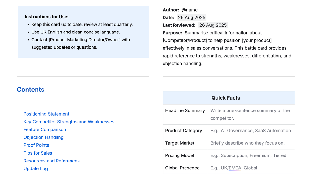
Dividers and layouts can be combined to add extra white space to pages
For an even cleaner look, combine dividers with Confluence’s layout feature to create columns. This adds more white space around your text, making your pages much easier to read and scan. Think of them as room for your users to breathe.
When to use dividers:
- Creating distinct sections on a page, such as on a project plan
- Separating different speakers’ notes in meeting minutes

Improve your page structure today
Mosaic includes numbered headings, tabs, and many more features designed to make pages more engaging than ever.


Written by