
How to make links more engaging with Confluence buttons
Share on socials
How to make links more engaging with Confluence buttons


Jump to Section
Jump to section
What are buttons?
How to create buttons in Confluence
- Create a single button
- Create a group of buttons
How to customise buttons
Why use buttons in Confluence?
4 ways to use buttons on your pages
Ready to create a better navigational experience for your users? With Confluence buttons, the solution is literally at your fingertips.
If you want to create the best Confluence pages, buttons are an ideal tool to have in your arsenal. With very little effort, the humble button can elevate content to be more user-friendly, engaging, and action-oriented.
So, let’s talk about how to create buttons in Confluence.
So, let’s talk about how to create buttons in Confluence.
What are buttons?
Buttons are a more engaging way to present hyperlinks. They’re interactive, eye-catching elements that help guide users through your content. You’ll often find them on forms and on webpage navigation menus.
In Confluence, buttons help create a more user-friendly and interactive experience by improving navigation and encouraging users to click through to important pages. They’re ideal for a wide range of uses, from a team hub to a Confluence knowledge base.

How to create buttons in Confluence
Because Confluence doesn’t have a built-in button feature, you’ll need an app from the Atlassian Marketplace. You have two choices:
- Buttons for Confluence: A dedicated app for creating and grouping buttons on your pages.
- Mosaic: Content Formatting Macros & Templates: An all-in-one macro toolkit that includes the Button macro, Button Group macro, plus many others like Tabs, Advanced Cards, and Backgrounds to help you build more engaging pages.
Try both apps free for 30 days and see which works for you:
Create a single button
- In the Confluence editor, type "/button’" and choose the Button macro.
- Choose a preset or click the "Customization" tab to start from scratch.
- Add your button text, choose a destination for your button to link to, and customise your button’s appearance.
- Click "Save" in the editor, then select "Publish" or "Update" in the top right corner of your Confluence page.
⚡ Pro tip: Want to link to a specific location on your page? Add a Confluence anchor macro to your destination page, give the anchor a relevant name, then use the #name in the "Destination" field of the Button macro editor (e.g. a "Notes" section could be referred to as #notes).
You can even link to a specific spot on a different page this way by preceding it with the full page URL (e.g. linking to the notes sitename.domain/wiki/Example+project#notes).
You can even link to a specific spot on a different page this way by preceding it with the full page URL (e.g. linking to the notes sitename.domain/wiki/Example+project#notes).
Create a group of buttons
You can also group buttons so they sit neatly next to each other. Here’s how:
- Create your buttons as usual, following the steps above for each.
- On your page, type "/button group" and select the Button Group macro.
- In the Button Group editor, choose the group’s alignment and direction (horizontal or vertical).
- Press "Save". You should be able to see the Button Group macro placeholder on the page.
- Finally, drag each Button macro into the Button Group macro placeholder.
- Publish or Update the page to see your grouped buttons.
How to customise Confluence buttons
You can customise your buttons in a variety of ways from the editor window:
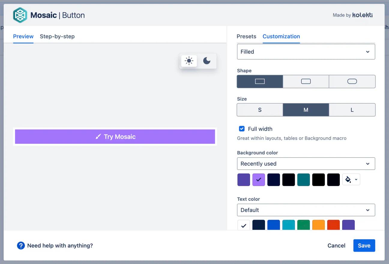
You can customise:
- Button icon: Optional but helpful for creating engaging buttons, choose an emoji, or pick an icon from Atlassian, FontAwesome, or Material Design.
- Button alignment: Align your button left, centre, or right on your Confluence page.
- Background colour and text colour: Choose from your brand palette (if you have Mosaic's Advanced Edition), recently used colours, or default macro colours for the background and text.
- Button style preset: Select a pre-designed button template to get started quickly.

Why use buttons in Confluence?
- Boost page navigation: Link to other Confluence pages in a visually striking way, helping users move between related content with ease.
- Provide clear Call To Actions (CTAs): Need users to take a specific action? A button is the best way to encourage clicks on form submissions, starting guides, and more.
- Boost user engagement: The visual, interactive nature of buttons draws attention and keeps users engaged in a way that plain links can’t.
- Improve brand consistency: Using your organisation’s colours is a great way to make your Confluence pages look more professional and on-brand.
Ways to use buttons in Confluence: 4 examples
Create a well-connected knowledge base

Create a central hub for your knowledge base by using buttons to guide users to popular topics or frequently asked questions.
For extra visual impact, you can embed your buttons inside a Background macro from Mosaic to create a stylish header section from your links.
For extra visual impact, you can embed your buttons inside a Background macro from Mosaic to create a stylish header section from your links.
Make company hub links more professional

On a company hub, buttons are perfect for directing employees to important resources, such as the staff directory, IT support, or HR policies. You can even embed your buttons within separate Background macros - formatted with layouts - to create engaging side-by-side sections.
Signpost resources on a product battlecard

When creating a sales or marketing battlecard, use a two-column layout to keep everything organised. In one column, use a set of buttons for quick links to key resources like competitor benchmarks, demos, sales enablement materials, and case studies.
In the other column, you can add useful at-a-glance data, such as an update log, to track changes and keep your team informed.
In the other column, you can add useful at-a-glance data, such as an update log, to track changes and keep your team informed.
Provide clear CTAs on a change management plan

When outlining a proposed change, use buttons to create an interactive contents section. This allows stakeholders to quickly jump to the information they need, whether it's the Roadmap, Cost and Considerations, or the Communications Strategy.
Ready to transform your Confluence pages? By making your links more interactive and visually appealing, buttons are a simple but powerful way to improve navigation and guide users to the right information. Try adding buttons to your pages today and see the difference it makes!

Level up your page design with Buttons and more
Mosaic gives you all the tools to create interactive, engaging pages.
Try it now with a 30-day free trial:
Related Content
Read more


Written by
Related Content
Read more